Do you remember this question back from art class in school? I always thought artists don’t really plan pictures to convey a message, they just have an idea and the rest is the talent to translate intuition into colors. They probably would have had a laugh if they could have heard the student’s ideas what might have been the intention of that red stroke down there in the left corner.
Why am I talking about this? I accidentally dropped a bottle of ink near one of my background canvases. I have a couple of those, cheap ready made painting canvas, grounded white and on a stretcher frame. I use them to reflect light or as backdrops. The ink splatter looked rather lost, so I decided to add some more. I tried to squirt a circle and used the shower to remove some of the ink. The result is the background you see in the pictures. Modern art, isn’t it?
But despite the post title it’s really just a background, and what I want to say is: The girls have more clothes :). I hope you are not tired of Viveca yet…
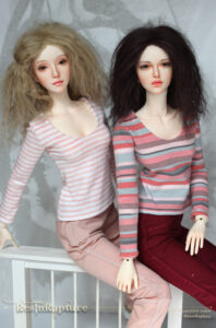
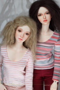
This time various stripes. Esmée and Viveca had a lot of fun posing for these.
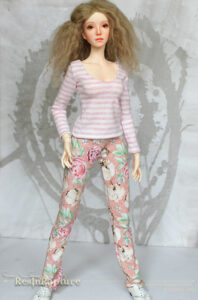
This is the flower fabric I found a while ago. And even if the pattern is quite large, I really like this, even on the smaller dolls. Maybe the stripes and the flowers are a bit much, but I didn’t want to waste the bit of light with picking a plain shirt. The combination actually looks a bit like PJs. Never mind :).
This is the plaid dress I posted before, I just wanted to add these to show you the full dress. The salmon colored tunic dress has a layered skirt.
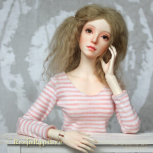
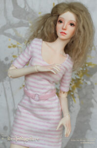
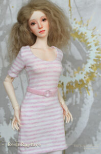
And I just love her hands and the way she can touch her face. The shirts look almost identical in the pictures, but the pictures where she touches her face show a light apricot striped shirt, the other one is pinker and the stripes are a bit smudged. I made a summer dress from this fabric and a quick belt to go with it as well. I love this girl in stripes and checks just as much as in flowers.
And I added a bit of gold and white to the background. So what DID the artist want to say with this? It was just an accident :D.









Hahaha, yes, it’s often true, the viewers or experts see much more in an artwork sometimes than the artist intended. The white is the finishing touch. 🙂 The girls look wonderful together in these pictures! The flower print fabric is lovely, absolutely Viveca’s style and colours. Love the pics of the full plaid dress and the layer on the salmon one. Viveca has beautiful expressive hands indeed, they suit well with her job, too. 🙂
If the artist intended anything at all :D. Thank you! It’s funny, Viveca makes me appreciate pink instead of just tolerating it. She makes it look mature somehow. Her hands are great, aren’t they? The old Raccoon hands look a bit stiff sometimes.
Lovely new clothes!
Thank you!
Hahaha. Dear Artist – I just want to say you made a great background. xD
Love this story. I was fed up with these tiresome interpretations and guesses. Finding the seventh bottom. This applies to both paintings and poems. Horror.
And the new clothes are fantastic!
Haha.. Who wasn’t? It’s like reading tea leaves. Thank you 🙂
Love your accident! I love listening to people ‘read’ things into my art. Most of the time there’s nothing to read or if there is, they get it wrong, lol.
Haha, Thank you! I can imagine how much fun that is. I guess as the artist you are very good at telling people what you meant by this or that, even if you didn’t think about it when you did it.
Comments are closed.