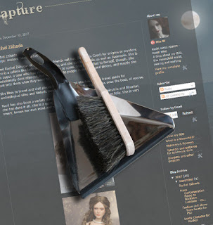
Time for a new design for my blog. A while ago I read about an interesting feature blogger has been offering for a while – I just didn’t know. If you type ‘/view’ after any bloggerdomain you can see what the blog looks like in the dynamic view mode. Several views, actually. I had to try it and I liked the clean look of the magazine view and the timeslide mode.
I told my blogging friend Balljointedwoman about it, and she beat me to it and picked the magazine look for her blog. It looks very good – really like a magazine (and her Diner is just fab). The downside is that there’s not much room for individual design ideas, and I had a bit more customization in mind. I spend the last two days playing around with several looks – as you might have noticed.
This is the result. I didn’t want to hide my doll profiles somewhere in the post archive, and all the tiny icons tend to give the blog a cluttered look. But I hope this new design looks cleaner and still like a Moonchild realm. I have to get used to the light colors, though. Unfortunately blogger tends to update the formatting templates with the designs, so there might be some odd looking older posts. If you come across some text formatting in old posts that looks like an accident please let me know in the comments.

Nee, kann ich leider nicht, mich stört das auch. Es ist der hervorgehobene erste Post, und ich könnte das Feature ganz weg machen. Dann ist da aber eine Lücke. Ich hab noch nichts ergoogeln können, wie man das fixt. Ja, Tageslicht.. muss ich mich auch dran gewöhnen. Ich wollte extra für dich ein rosa quadrat posten zur Begrüssung. Aber da die anderen Leser die deutschen Kommentare nicht lesen können, wäre das ein Insider gewesen ;). Dir noch einen Blues-freien Weihnachtsrest 🙂
Jetzt ist der Promi-Post weg. Besser.
It looks great! Clean and well-organized, and the colors are like moonlight. I was too lazy to customize; I accepted the format as Blogger presented it. Love your photo with the brush and dustpan! Very clever.
Thank you :). Even if you had wanted to customize, the dynamic views don't allow for much more than picking a background color- that's why I decided against the magazine look. I wish this template would offer that two column preview of post-snippets as well.
Comments are closed.